“An ambitious “brand strategy” project that goes far beyond communication”

BNP Paribas Personal Finance has recently strengthened the consistency of its brand portfolio in the
world with a new architecture that combines the identity of the BNP Paribas Personal Finance brand with
harmonization of trademarks.
This optimization around the attributes of the Cetelem brand is in line with the company's adaptation to a highly competitive and fast-changing market, with the central objective of meeting the new expectations of its customers.
In order to give you a global vision of the "brand strategy" initiative, Véronique Boireau who managed the project, Tania de Sá Marchāo, who was in charge of the external deployment in Portugal and Lusia Lucas who led the internal deployment of the new visual identity to the Portuguese teams, tell us how everything was articulated.
Could you introduce yourself please?
Véronique: I am Véronique Boireau Project Manager in the Brand, Communication & Prospects department in charge of transversal subjects including BNP Paribas Personal Finance's brand strategy.
Tania: My name is Tania de Sá Marchāo, and I’ve been “Advertising & Commercial Manager” for Cetelem in Portugal for the past 11 years.
Luisa: My name is Luisa Lucas, I’ve been working at Cetelem in Portugal for the past 13 years, in the internal communications department.
Where did this project for the brand portfolio come from?
As international developments occur, takeovers, JVs,… BNP Paribas Personal Finance's brand portfolio had grown in size and this, without a real "architecture". It became a necessity to engage a reflection on both a new brand strategy for BNP Paribas Personal Finance and a new strategy for BNP Paribas Personal Finance visual identity for its commercial brands that would adapt to the development of activities and new developments
uses in terms of communication.
What were the motivations ? The reasons ?
Véronique: We are present in about 30 countries around the world with different business models; a state
of the locations of all the brands involved was the first level of reflection. In order to be able to respond to the
(or) the question(s) of "why this (these) brand(s)? which brand(s) to support the development of our
and that of our offers? ", two things were needed: to structure the approach around our targets and to build
"a decision tree" by typology.
We have conducted reputational studies to "evaluate" brands, from the perspective of their "real" value on
their respective markets, depending on the target or targets they were targeting. This allowed us to streamline the entire portfolio.
Where did this project for the brand portfolio come from?
As international developments occur, takeovers, JVs,… BNP Paribas Personal Finance's brand portfolio had grown in size and this, without a real "architecture". It became a necessity to engage a reflection on both a new brand strategy for BNP Paribas Personal Finance and a new strategy for BNP Paribas Personal Finance visual identity for its commercial brands that would adapt to the development of activities and new developments
uses in terms of communication.
This project, which opened at the end of 2016, thus found its place among the 54 initiatives of BNP Paribas Personal Finance's strategic plan.
What were your inspirations ? Biases ?
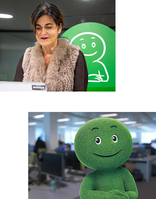
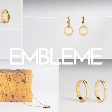
Véronique: Consistency and flexibility. Consistency to build a solid brand portfolio, referent and that is one of the reasons for us we have capitalized on two attributes that are the green color and the mascot in major that we are highly characteristic. Flexibility to be able to support our various activities and operating methods while federating pride
of belonging in all the geographies where we operate.
How was rebranding conceptualized?
Classic with the creation of tools : brand use guide, new mascot postures, blocks brands, iconography, pictograms, colour palette… for the attention of communication and media professionals both internal and external marketing.
With the will, which is ours, to create a strong visual identity throughout the world and especially in Europe;
these reference tools are the essential foundation for the identity creation of all our media of corporate and commercial communication.
Did you face any specific constraints, before or during the project?
Véronique: Constraints are inevitably going to be a part of any project of this scope, but in this case they became driving forces. For example, the versatile use of our brands depending on the area of business activity and its target audiences led us to develop an asset that allows flexibility and agility to support our offers and communications. The shift from a single brand unit towards a flexible system of identity demonstrates our ability to adapt to a new brand asset. This is important for today and tomorrow.
Tania: The deployment was relatively seamless in Portugal as we were one of the countries with the most extensive online presence, backed by the brand strategy. In the “corporate” and Business to Business (B2B) domain, the BNP Paribas Personal Finance brand already existed, so the changes were minor. On the Business to Business to Consumer (B2B2C) side, we worked with teams from the various regions to share with them the graphical elements of the new visual identity, including logos, pictograms and iconography, so that they could, in turn, share these with partners and coordinate all the changes this inevitably entailed.
We also updated all of the advertising media at sales points.
What has the main impact of this rebranding project been?
Véronique: Although important to apply, the changes have not been drastic owing to the fact that we’ve retained the brand’s strong hallmarks. A decision was therefore taken very early on that there would be no D-Day.
The deployment of our new visual identity essentially takes place as new sales and service offers are developed, new marketing campaigns are launched, when Head Office moves premises in a certain country or when documents are updated. Of course, when it comes to digital channels, everything gets updated much faster.
Luisa: Internally in Portugal, the impact was significant; it wasn’t a case of only changing logos! We transitioned to a flexible corporate identity system with a new visual identity, a new corporate look-and-feel and a new mascot.
What, from your perspective, has the greatest success of the project been?
Véronique: The choice of the flexible corporate identity which has gathered a strong following internally, and the change of mascot which is universally liked.
Luisa: Employees identify more closely with the new visual identity, which is more modern, more appealing, and more versatile.
What are your expectations following the rollout of the project?
Véronique: I have high expectations. The primary objective is the uptake of the new visual identity in order to boost company exposure in future, irrespective of how this is conveyed across the various territories where it is currently, and will be present in future. To some extent, BNP Paribas Personal Finance's success will depend on the drawing power of its brand in the market itself.
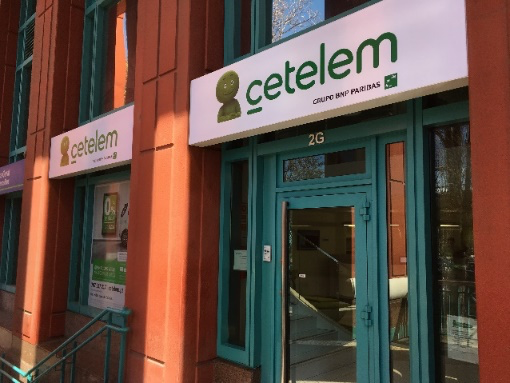
Can you tell us about the Cetelem brand’s rollout plan in Portugal?
Tania: Cetelem has been operating in Portugal since 1993. The brand is very well known, it is the leader in the personal loan sector. This has been a great challenge for us!
The timing aspect was critical to the success of the launch of the brand’s new visual identity in Portugal. We went to great lengths to update as many advertising media as possible, while concurrently creating a “buzz”. We were ready for launch in March, which included updating of mail signatures, the website and apps, and we successfully launched our media campaigns with a new “Cetelem, a well thought out loan, just like the projects it supports” catchphrase.
We also attracted the attention of the television show Imagens de Marca (Images de marque) José Pedro
Pinto, our marketing manager, was interviewed on the rebranding of the Cetelem brand and its new
advertising campaign.
Luisa: Our advertising plan was developed with a sense of “curiosity” as the guideline.
On January 30th, we launched the first teaser stating: “Yes, it’s true, Cetelem is changing its logo!” “It will be revealed from February 1st”. We gradually began to advertise and use the new logo on 7 March which was the official external launch date, and massive advertising campaigns were launched for the new logo.
Did you have certain fixed targets?
Tania: Our main aim was to apply the change rapidly, whatever the target audience. Our hope now is that by the end of 2020, other countries will join the movement. We work hand in hand with the Brand Communication Prospective team, and we share advertising assets with other countries with the aim of contributing towards the project’s success.
How would you describe this project in a few words?
Véronique: An ambitious project that extends well beyond simple communication, as the brand is a strong, living asset for a company.
Luisa: The initiative called for a lot of hard work, but it was all done with a positive spirit. We are pleased with the results; employee feedback has been very positive.
Tania: It has been nothing short of a marathon. It was a substantial project. It provided the perfect opportunity to update important media. We love the new logo and everything it represents.


![[On The Way] Benoit Tholence – Sanka: a bike that takes the codes of the car, to replace the second car!](https://personal-finance.bnpparibas/app/uploads/sites/4/2024/03/visuel_site_pf_sanka-copie-386x386.jpg?1709651557)

![[On The Way] Too Good To Go, for a world without food waste](https://personal-finance.bnpparibas/app/uploads/sites/4/2024/01/img_3617-386x386.jpeg?1706623554)
![[On The Way] Heïdi Sevestre – The melting of glaciers: it is urgent to consume sustainably](https://personal-finance.bnpparibas/app/uploads/sites/4/2023/12/heidi_sevestre_banner_echonet_2-386x386.png?1703587539)